Final Music Video
Sunday, 16 January 2011


Monday, 10 January 2011
EVALUATION
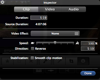 This screen shot shows an example of how we muted the sound of the footage to then play the sound track over the footage.
 Above shows a screen shot of an example of colourisation within our music video. We made this part of the video higher and brighter in colour as we wanted to show a significance difference at this part of the video as we find it an important part and wanted to show this visually through colour.
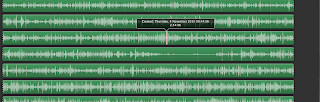 This screen shot shows the soundtrack music for our music video.
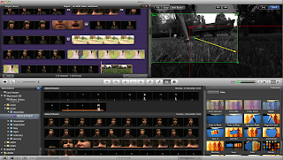
Within our music video we did use an editing process called ken burns. This shows when dragging the arrow the way you want the shot to go it then makes the shot pan the way you want it to.
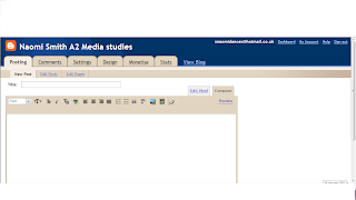
This is a print screen of the blogger account that I have used within my planning, constuction and evaluation stages.
Question 4/
How did you use new media technologies in the construction and research, planning and evaluation stages?
Through the research, planning, construction and the evaluation stages I have used many new media technologies within this question I will discuss what type of new media technology I have used for what part of my portfolio.
When Starting of with my research and beginning to plan for my music video and ancillary tasks I used the Internet to research other artists to get inspiration for my own work. When I would find research that was relevant for what I was researching I would put the information on to blogger.com. Blogger.com is an online diary where i can post planning stages such as research into other artists and how they have used the conventions of Goodwin's theory for example. I used blogger.com to post everything that I have learnt throughout this project and everything that I plan to do to make my project successful, such as storyboard, shooting schedules videos of other artists music videos when researching them.
We used Canon digital video cameras when we started filming after we had our storyboard planned. We used a tripod when necessary such as when the singer was on the stool singing we needed a steady straight shot or when the camera panned when the woman and man were walking in the narrative part of the music video. We then used a hand held camera effect when we didn't want such a steady shot e.g. when the woman walked across the field and the shot shows a high angles shot.
Through the research, planning, construction and the evaluation stages I have used many new media technologies within this question I will discuss what type of new media technology I have used for what part of my portfolio.
When Starting of with my research and beginning to plan for my music video and ancillary tasks I used the Internet to research other artists to get inspiration for my own work. When I would find research that was relevant for what I was researching I would put the information on to blogger.com. Blogger.com is an online diary where i can post planning stages such as research into other artists and how they have used the conventions of Goodwin's theory for example. I used blogger.com to post everything that I have learnt throughout this project and everything that I plan to do to make my project successful, such as storyboard, shooting schedules videos of other artists music videos when researching them.
We used Canon digital video cameras when we started filming after we had our storyboard planned. We used a tripod when necessary such as when the singer was on the stool singing we needed a steady straight shot or when the camera panned when the woman and man were walking in the narrative part of the music video. We then used a hand held camera effect when we didn't want such a steady shot e.g. when the woman walked across the field and the shot shows a high angles shot.
After filming we started editing using the Mac computers and using a edition software called iMovie. We used different effects to create what we created for our final music video. To lip sync the music video we muted the sound that we had picked up from filming and then put the soundtrack on top. We then needed to match the movement of the singers lips to the lyrics heard. We did use colourisation within out music video. Within the narrative part of the video we used iMovie and colourisation technique of turning the footage black and white. We only did this for the narrative part of the music video to show a flashback and almost a film view of the music video. The main part of the narrative part of the music video when the woman catches the man with another woman we made the colour of the footage brighter and higher in tensity to what the normal colour of the footage would be. We did this effect specifically at this times of the video within the narrative part to single out the importance of this part of the story. The editing software made sure that we can use transitions within the music video to give the effect it is a music video. When using iMovie we also used a technique called ken burns this simply meant we could pan a shot without panning it within filming. It presented us with an arrow and we would pull the arrow in the direction we wanted the shot to pan. We used this frequently mostly within the performance section of the music video.
When doing the ancillary tasks I used lighting effects to enhance the lighting on the lighting of the same photograph what we created for both of the ancillary tasks. I used serif photo plus to adapt the lighting of the front cover photograph of the digi-pack and the main photograph on the magazine poster. I also made the atcual ancillary tasks on serif page plus 11 which is a piece of software that has many tools possible to make a Digi-pack and ancillary task. Within the filming of the music video we did have an issue with lighting as we wanted a spotlight above the artists head, this was not possible so we used the normal lights but as it was on a stage we could adapt the lighting by using certain lights available to us at the time.
When doing the ancillary tasks I used lighting effects to enhance the lighting on the lighting of the same photograph what we created for both of the ancillary tasks. I used serif photo plus to adapt the lighting of the front cover photograph of the digi-pack and the main photograph on the magazine poster. I also made the atcual ancillary tasks on serif page plus 11 which is a piece of software that has many tools possible to make a Digi-pack and ancillary task. Within the filming of the music video we did have an issue with lighting as we wanted a spotlight above the artists head, this was not possible so we used the normal lights but as it was on a stage we could adapt the lighting by using certain lights available to us at the time.
When using my blog to help me with my research and explaining my research I needed to use software and be able to put certain software on to my blog. I used different types of software such as uploading photographs I had print screened previously straight on to my blogger account. I also used YouTube to research in to different types of music videos to analyse them I then embedded these videos on to my blogger account.
I did have trouble uploading my video response for question 3 within the evaluation. When I tried uploading my video it would not work. As it would not work I had to figure out what the problem was and resolve it. I looked on what movie type files blogger accepted. One of these was a Quicktime file. I think the reason for why my video was not letting me upload was because the file was too big. I eventually found a piece of software called movie plus which I downloaded. This made the file into a Quicktime file and I was then able to upload the video on to my blog.
 This screen shot shows an example of how we muted the sound of the footage to then play the sound track over the footage.
This also the way that stabilization works which we used. We simply selected a section of footage and stabilized it as parts were slightly shaky.
Above shows a screen shot of an example of colourisation within our music video. We made this part of the video higher and brighter in colour as we wanted to show a significance difference at this part of the video as we find it an important part and wanted to show this visually through colour.  This screen shot shows the soundtrack music for our music video.
Within our music video we did use an editing process called ken burns. This shows when dragging the arrow the way you want the shot to go it then makes the shot pan the way you want it to.

This is a print screen of the blogger account that I have used within my planning, constuction and evaluation stages.
Sunday, 9 January 2011
EVALUATION
Question 2/
How effective is the combination of your main product and ancillary texts?
I would say the image motif that we have shown through our music video, digi-pack and magazine poster would be the stool that is pushed over within the video, and is also shown within the digi-pack and the magazine poster. I would say the black and white theme and house colours is a good example for our image motif. I think importantly the black coat that the singer wears throughout the whole video shows a good link for image motif as the audience may remember the coat that is the only clothing on the woman that is shown along with the pink high heels.


The photo's above are the actors within our music video, who also appear within our digi-pack and magazine poster.
Question 2/
How effective is the combination of your main product and ancillary texts?
We wanted to keep the three promotional pieces very similar to each other we did this by keeping the house colours, typography, images, layout design, Genre characteristics, industry information and use of still shots used both in the digi-pack and magazine advert all very much similar. For our main product (the music video) and for our ancillary tasks we wanted very distinctive house colours as apart of our brand identify. We picked Orange, red and black for our house colours as we thought it fitted well for the genre of our music video as the story was of an angry upset woman trapped within a love triangle, the red represents the love and passion of the song, orange represents the anger and betrayal and black represents the sadness of the singer within the song. When creating the ancillary tasks and the music video we realised that we also used a black and white house colour theme as within the narrative part of the video within the flashbacks we showed the footage through black and white. We then when making the ancillary tasks made the front cover black and white and the inside panels black and white. We show all of these house colours clearly through all three promotional pieces. We have shown this video as the stool that the singer is sitting on has fabric placed over it a  black, Orange and red cloth, which is shown throughout the video and more closely when the singer knocks the stool over. The pattern continues with the ancillary tasks as the digi-pack shows the same picture of the stool fallen over with the cloths on it exactly how it fell over in the video. The magazine advert continues the pattern for house colours as the whole background is red that shows one of the house colours.
 black, Orange and red cloth, which is shown throughout the video and more closely when the singer knocks the stool over. The pattern continues with the ancillary tasks as the digi-pack shows the same picture of the stool fallen over with the cloths on it exactly how it fell over in the video. The magazine advert continues the pattern for house colours as the whole background is red that shows one of the house colours.
I would say the image motif that we have shown through our music video, digi-pack and magazine poster would be the stool that is pushed over within the video, and is also shown within the digi-pack and the magazine poster. I would say the black and white theme and house colours is a good example for our image motif. I think importantly the black coat that the singer wears throughout the whole video shows a good link for image motif as the audience may remember the coat that is the only clothing on the woman that is shown along with the pink high heels.
The genre of the music is a very soft slow song. We knew that we needed to show soft transitions within the video as it would match more with the genre characteristics rather than quick cuts that would not.
We have used a similar approach to the house colours for the typography involved across the digi-pack and the magazine advert. We have used both of the fonts Dutch801 Rm BT Bold and foot light MT Light for our digi-pack and our magazine advert. We researched different typography that other artists have used on their album covers and magazine posters and also different font styles that are available to us. We came across these fonts and thought they were very elegant and perfect for the genre of music we are using. It also gave the writing a film approach to writing and as our music video is intertexual with a film we thought this was ideal.

We have used a narrative and performance based approach to our music video where all the audience watches is the singer singing but then it starts showing the story of why she is so upset within the narrative part of the music video. The music video within the narrative part is almost like a thriller/romance genre of a film we show this through images on the digi-pack deign as we show different images to suggest a film such as the photograph of the torn up diary.

The use of industry information is very similar across both ancillary tasks such as the logos we have used e.g. the Sony music logo and RCA the record company that Christina Aguilera actually does use on both the digi-pack and magazine advert.
The use of still shots from the video used in the digi-pack and the magazine are all very much similar to each other. Within the video it shows the stool with the house colours shown from the fabric that was on the stool. When we filmed the woman pushing over the stool we then took a photograph of the stool exactly how it fell within the video. We then put this image as a picture on the insert panel of the digi-pack. The front cover of the magazine advert and the front cover of the digi-pack are very similar. They both have a combination of all three actors from the video's faces to make one final face. The only signature that is different is the lighting and colouring is different on each.


The photo's above are the actors within our music video, who also appear within our digi-pack and magazine poster.
EVALUATION
Question 1/

 House colours, Orange, red and black.
Question 1/
In what ways does your media product use, develop or challenge forms and conventions of real media products?
My final music video and ancillary tasks consist of a video, digi-pack and magazine poster of christina Aguilera's song 'You lost me' is now completed. I will now discuss in what ways my mediaproducts use, develop or challenge forms and conventions of real media products. I find with my music video I did challenge forms and conventions as I didnt use all of goodwins theory, however I did use his theory too. I used the notion of looking; I developed this convention by only using the notion of looking in small doses as I wanted to give a subtle effect and not such a direct approach towards the audience.
 I used within the music video music to visuals, as within the flashbacks the man is seen pulling the woman back into his arms and my partner and I made the movement match the beats of the music. Within Goodwin's theory I did use music to visulas but we didn't really use lyrics to visuals which is also apart of Goodwin's theory. My partner and I decided not to use this particualr convention as we didn't think it would fit within the music video as a lot of the lyrics would be hard to be shown visually.
My music video shows a performance/narrative concept which does follow Goodwin's theory of genre characteristics. As it shows the main 'performer' singing, it then also shows her within her own story of what she is singing. My partner and I wannted an intertextual reference to our music video. We decided to display this intertextual concept as a film. When the flashbacks are shown it looks like a thriller film, this was good as this is what my partner and I wanted to achieve as we found intertextuality interesting.When we were editing our music video and saw this 'film like' part of our video we were worried it looked to much like a thriller, however once we watched it back my partner and I thought it worked with the other parts of the performance parts of the music video. The screen shot below shows the back and white flashback for the narrative part of the video.
Close-ups was very important to my partner as the song we have chosen to do was very emotional. The close-ups are part of the convention of music videos as suggested in Goodwin's theory gave us an opportunity for our actress to show true emotional in her face while she was lip syncing to the song. We used different close-ups and extreme close-ups such as the actress eyes and lips.
When doing the ancillary tasks my partner and I wanted to kepp continuity between the ancillary tasks and the msuic video. My partner and I did this by keeping the same house colours this has created a brand identity. When filming we originally by chance found our house colours fabric that we found as we wanted to put it on the stool for the actress to sit on. The colours were reds, orange and black. We thought these colours were perfect as they showed the coulours of being angry, passionate and sad which the 'singer' within our music video was. We showed a lot of this on our CD pack and magazine poster. I also showed on the digi-pack all of the same actors from the same actors from the music video. I also on my digi-pack named the album diary of my broken heart, then on the one of the pictures on the gigi-pack showed a photograph of a ripped up bits of the 'singers' diary zoomed in, with different songs from the album and different lyrics from the single and music video on torn up bits of paper from her diary. Also to show brand identity I have used the same two font's Dutch 801 Rm BT Bold and Footlight MT Light within both the digi-pack and the magazine poster.
 House colours, Orange, red and black.
I have found that I have used Goodwin's theory more than I haven't used his theory as I have shown a relationship between music and visuals, I have shown intertextual reference, i have used the notion of looking, i have used close-ups of the artist and it is based mainly on a performance/narrative based type of music video.
We have used a small dose of the notion of looking within the music video, we only wanted to have a subtle approach to the notion of looking as we thought too much notion of looking did not fit with our particular music video. It also did not fit with the intertextual element we wanted to have for our video of being simular to a fillm, as within a film the actor does not normally look at the camera.
Thursday, 6 January 2011
 Final CD cover
This is mine and Adam's final Digi pack design. We used all of our own images and edited  them to give the effect we wanted. To make our front cover of the CD cover we got inspiration from the kings of leon CD cover from their album 'only by the night'. We started of by taking seperate photography of each of the characters from the music video and then combining the faces to make one face. We wanted to give the effect that they are trapped within eachother lives within a 'love triange'. We wanted the cover to be simple at the same time so we used simple dark colours such as black and grey. We thought this would work as the colour black fits into our house colours as within the fabric from the stool there appears black within the music video and the Digipack. We have shown the picture of the stool fallen on the ground as it appears in the music video to keep continuality we show this in the insert flap. On the back cover of the digipack we show pages of a diary ripped up with songs from the CD and lyrics from the song of the music video, on the pieces of paper. We decided to use red as the colour for words for the song list as red fits with our house colours however we also used white for some songs as we have used white within the the poster and it works well with the original house colours.
 them to give the effect we wanted. To make our front cover of the CD cover we got inspiration from the kings of leon CD cover from their album 'only by the night'. We started of by taking seperate photography of each of the characters from the music video and then combining the faces to make one face. We wanted to give the effect that they are trapped within eachother lives within a 'love triange'. We wanted the cover to be simple at the same time so we used simple dark colours such as black and grey. We thought this would work as the colour black fits into our house colours as within the fabric from the stool there appears black within the music video and the Digipack. We have shown the picture of the stool fallen on the ground as it appears in the music video to keep continuality we show this in the insert flap. On the back cover of the digipack we show pages of a diary ripped up with songs from the CD and lyrics from the song of the music video, on the pieces of paper. We decided to use red as the colour for words for the song list as red fits with our house colours however we also used white for some songs as we have used white within the the poster and it works well with the original house colours.
  My final ancillary magazine poster
 Adam and I are presenting two different magazine posters as a part of our ancillary tasks. I did make a magazine poster before but after getting an opinion from my teacher and other students i decided to change the poster as i wasnt happy with the final outcome. For my new magazine advert I used the original image from the CD cover that we both made. I wanted to use the same image as the CD cover to show a link between the package together. Instead of just keeping the same image i made the image red along with the background as it represents the house colours that adam and i chose for our ancillary tasks and the music video itself. I have used the typeography that i found and shown in a previous post. The first draft is simular to the final copy at first i just put black edges on two sides of the page. I did this to represent the curtains within the music, I showed my teacher and got feed back she said that i should add the back edges on the top and bottom as it looks more like a finished product.
Final magazine poster

Monday, 6 December 2010
Typeography
Once we had planned what we was going to do as in terms of layout within our digipack we needed to decide on different aspects of what was going to be within the digipack, such as photographs and most importantly typography.
When planning on what type of typography we wanted to make sure we knew exactly what we wanted. We did this by making a mini spec for ourselves this contained three objectives.
- Plain and simple, we wanted this as we didnt want to distract the audience from the title itself.
- Elegant, We wanted it to be set out as elegant and mature to match the film theme and all around attidude of our music video.
- Something that would be appealing across all of the projects.
When making a decision we decided on two fonts called 'Dutch801 Rm BT bold' as the main font and 'Footlight MT Light' as our secondary font.


Mine and Adams pitch to the class.
Adam and I pitched our idea to our class as we wanted to know if people would like our idea. We spoke to the whole class and our teacher explainning what we intend to do for the music video and showed everyone work from one of our blogs. We showed them storyboards, the song its self and the video that has already been created for the song, we talked about what genre of music video it is and whether its a narrative, concept, or performance based music video. We handed out sheets to the class asking what they liked about our idea, and how could we improve what we intend to do. Below is a video of the pitch.
shooting schedule
Because we have finished our filming we could now give an evaluation within the shooting schedule. We extended this on two shooting schedules which is presented below.


Friday, 3 December 2010
Editing Diary day 4: 25th November
At this time the flashbacks that we had put together looked better and made more sense as a whole. When filming we used the hand held effect as we wanted to give the effect of the audience looking through the womans eyes, we put this flash back into balck and white which we both thought worked well.
At this time the flashbacks that we had put together looked better and made more sense as a whole. When filming we used the hand held effect as we wanted to give the effect of the audience looking through the womans eyes, we put this flash back into balck and white which we both thought worked well.
Editing day 3: 22nd November
Today we planned to added the flask backs within the music video. We tried to stick to our final story board very closley but we have made some changes through editing. We have decided to show the flashbacks in a black and white effect from the macs. I found sometimes that the flashbackd did look a bit out of place and just filling up the time within the video but we are hoping after more editing and when the video is completed then it will look a more together piece.
We did find some of the shots to be unstable, so we stabilized the shots this was to help the tranistions flow better. When changing the flash backs to black and white we dropped the brightness by 66% as the lighting looked to bright for the effect we wanted to give.
Today we planned to added the flask backs within the music video. We tried to stick to our final story board very closley but we have made some changes through editing. We have decided to show the flashbacks in a black and white effect from the macs. I found sometimes that the flashbackd did look a bit out of place and just filling up the time within the video but we are hoping after more editing and when the video is completed then it will look a more together piece.
We did find some of the shots to be unstable, so we stabilized the shots this was to help the tranistions flow better. When changing the flash backs to black and white we dropped the brightness by 66% as the lighting looked to bright for the effect we wanted to give.
Editing day 2: 19th November
We have had some difficult experiences with lip syncing as we have found it to be very difficulkt matching the mouthing of our actor to the atcual uploaded recorded song. The lip syncing is getting better now we know how to over come issues. This was partly effected from the transitions we placed within the project as when we made the lip syncing fitting to the song we then would put a transition before or after the singing, this would then make the timing out again n the lip sycing. We over come this by making sure we put transitions in before placing the shots into the project.
We did find the tranistions hard to fit in at times as we set the transitions to be for one second but after watching it we found it to be to quick so we have decided to slow the transitions down. We have decided to have a slow dissolve for most of the transitions but have one as a cross dissolve as we thought it fitted the time of the music video better.
We did notice that the lighting on the footage wasn't good and found it to be grainy and dark. But we found out that it was the same for other groups this meant it was the cameras not our filming.
By the end of this time we had got 30 seconds of footage completed.
We have had some difficult experiences with lip syncing as we have found it to be very difficulkt matching the mouthing of our actor to the atcual uploaded recorded song. The lip syncing is getting better now we know how to over come issues. This was partly effected from the transitions we placed within the project as when we made the lip syncing fitting to the song we then would put a transition before or after the singing, this would then make the timing out again n the lip sycing. We over come this by making sure we put transitions in before placing the shots into the project.
We did find the tranistions hard to fit in at times as we set the transitions to be for one second but after watching it we found it to be to quick so we have decided to slow the transitions down. We have decided to have a slow dissolve for most of the transitions but have one as a cross dissolve as we thought it fitted the time of the music video better.
We did notice that the lighting on the footage wasn't good and found it to be grainy and dark. But we found out that it was the same for other groups this meant it was the cameras not our filming.
By the end of this time we had got 30 seconds of footage completed.
Editing day one: 15th November:
Now that we have uploaded all of our footage we have now started editing. We will find it hard to edit on a current basis as there are only five macs and we are sharing a mac with another group.
Once the footage was uploaded we needed to look through all of the footage and select what shots we would want to use within the music video. As there was a lot of footage this was difficult to achieve. We started to place the shots into the project and manage to get ten seconds of the video started. We did positivly manage to choose the shots we wanted for the whole music video.
Now that we have uploaded all of our footage we have now started editing. We will find it hard to edit on a current basis as there are only five macs and we are sharing a mac with another group.
Once the footage was uploaded we needed to look through all of the footage and select what shots we would want to use within the music video. As there was a lot of footage this was difficult to achieve. We started to place the shots into the project and manage to get ten seconds of the video started. We did positivly manage to choose the shots we wanted for the whole music video.
Tuesday, 30 November 2010
Original images taken for ancillary task: CD Cover- our first ancillary idea:


These images are from our new idea for our ancillary tasks they show the two woman and the man from our music video. We plan to merge the left side of the blonde womans face (eye and nose) and the other womans right side (eye and nose). We then plan to merge the mans chin on to the face. This idea will be presented on the front cover of the digipack. On the reverse front cover we hope to present the fallen over stool that is shown within the music video we took the image while filming to keep continuity. This will show our house colours which are oranges and reds, within the music video and within the CD cover. The third panel we want to show a torn up bits of the womans diary with certain relevant words on the pieces of paper from the music video and single. We need to add another panel to meet the conventions of a CD cover. We plan to have a simple black background with a simple font in the colour of orange for the song list this is to keep the house colours. We plan to have apart of the cloth from the stool shown on the back as apart of the design.
 We did our editing for our digi pack on serif page plus 11 and serif photo plus, this made it possible to combine the photographs together to make one face. We also changed the lighting of the photograaph to give it a better effect.

The process for the second panel of the digi pack. This shows all of the house colours. The stool that is fallen in the photograph is the same as how it fell within the music video.
 The process of the third panel of the digi pack. This photograph shows what i meant to be torn up bit of paper from a diary. It shows lyrics from the song and also shows apart of the song list.


These images are the photos Adam and I took while filming. We wanted to use the photos from when when we filmed to show house colours.


These images are from our new idea for our ancillary tasks they show the two woman and the man from our music video. We plan to merge the left side of the blonde womans face (eye and nose) and the other womans right side (eye and nose). We then plan to merge the mans chin on to the face. This idea will be presented on the front cover of the digipack. On the reverse front cover we hope to present the fallen over stool that is shown within the music video we took the image while filming to keep continuity. This will show our house colours which are oranges and reds, within the music video and within the CD cover. The third panel we want to show a torn up bits of the womans diary with certain relevant words on the pieces of paper from the music video and single. We need to add another panel to meet the conventions of a CD cover. We plan to have a simple black background with a simple font in the colour of orange for the song list this is to keep the house colours. We plan to have apart of the cloth from the stool shown on the back as apart of the design.
 We did our editing for our digi pack on serif page plus 11 and serif photo plus, this made it possible to combine the photographs together to make one face. We also changed the lighting of the photograaph to give it a better effect.
The process for the second panel of the digi pack. This shows all of the house colours. The stool that is fallen in the photograph is the same as how it fell within the music video.
 The process of the third panel of the digi pack. This photograph shows what i meant to be torn up bit of paper from a diary. It shows lyrics from the song and also shows apart of the song list.
Cd covers and magazines that have given inspiration.
After changing our initial idea for our CD cover and magazine advert we found a band that gave us inspiration for our new idea. The band is called 'kings of Leon'. After looking at there CD cover for their album 'only by the night' we thought it would be great to do something similar for the purpose of our music video.
 When looking at this CD cover and one of the music videos called 'sex on fire' i saw an immediate relationship between them both. I saw the bird like face within the band members faces and then when watching the music video i saw a bird several times this has shown an immediate theme.
I also noticed there are similar colours presented within the CD cover and muic video 'sex on fire'. A lot of the colouring within the music video is very dark earth colours, this is too presented on the CD cover showing green for 'face'.
After changing our initial idea for our CD cover and magazine advert we found a band that gave us inspiration for our new idea. The band is called 'kings of Leon'. After looking at there CD cover for their album 'only by the night' we thought it would be great to do something similar for the purpose of our music video.
 When looking at this CD cover and one of the music videos called 'sex on fire' i saw an immediate relationship between them both. I saw the bird like face within the band members faces and then when watching the music video i saw a bird several times this has shown an immediate theme.
 I also noticed there are similar colours presented within the CD cover and muic video 'sex on fire'. A lot of the colouring within the music video is very dark earth colours, this is too presented on the CD cover showing green for 'face'.
Our idea for our new ancillary task


Our idea for our new ancillary CD cover design came from the Cd cover from the band kings of leon and their album, 'Only by the night'. We liked how the band members faces have been in a way blended together to make one face and then with what looks like bird features added. We wanted to do something simluar that would related to the music video and song. This particular CD cover gave us inspiration as we thought it was clever to merge the faces together as it show the man having both women in his life. We want to have one eye for one of the woman and another eye for the other woman and the mouth and chin for the man. We want to give this an effect of the woman watching
like within the music video.

This is our idea for our CD cover as shown their is the women both shown within the music video along with the man.
Final storyboard


Subscribe to:
Posts (Atom)