Final Music Video
Naomi Smith A2 Media studies
Sunday, 16 January 2011
Monday, 10 January 2011
Through the research, planning, construction and the evaluation stages I have used many new media technologies within this question I will discuss what type of new media technology I have used for what part of my portfolio.
When Starting of with my research and beginning to plan for my music video and ancillary tasks I used the Internet to research other artists to get inspiration for my own work. When I would find research that was relevant for what I was researching I would put the information on to blogger.com. Blogger.com is an online diary where i can post planning stages such as research into other artists and how they have used the conventions of Goodwin's theory for example. I used blogger.com to post everything that I have learnt throughout this project and everything that I plan to do to make my project successful, such as storyboard, shooting schedules videos of other artists music videos when researching them.
We used Canon digital video cameras when we started filming after we had our storyboard planned. We used a tripod when necessary such as when the singer was on the stool singing we needed a steady straight shot or when the camera panned when the woman and man were walking in the narrative part of the music video. We then used a hand held camera effect when we didn't want such a steady shot e.g. when the woman walked across the field and the shot shows a high angles shot.
When doing the ancillary tasks I used lighting effects to enhance the lighting on the lighting of the same photograph what we created for both of the ancillary tasks. I used serif photo plus to adapt the lighting of the front cover photograph of the digi-pack and the main photograph on the magazine poster. I also made the atcual ancillary tasks on serif page plus 11 which is a piece of software that has many tools possible to make a Digi-pack and ancillary task. Within the filming of the music video we did have an issue with lighting as we wanted a spotlight above the artists head, this was not possible so we used the normal lights but as it was on a stage we could adapt the lighting by using certain lights available to us at the time.
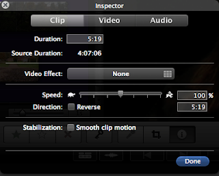
 This screen shot shows an example of how we muted the sound of the footage to then play the sound track over the footage.
 Above shows a screen shot of an example of colourisation within our music video. We made this part of the video higher and brighter in colour as we wanted to show a significance difference at this part of the video as we find it an important part and wanted to show this visually through colour.
  This screen shot shows the soundtrack music for our music video.
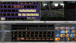
Within our music video we did use an editing process called ken burns. This shows when dragging the arrow the way you want the shot to go it then makes the shot pan the way you want it to.

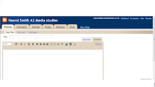
This is a print screen of the blogger account that I have used within my planning, constuction and evaluation stages.
Sunday, 9 January 2011
Question 2/
How effective is the combination of your main product and ancillary texts?
 black, Orange and red cloth, which is shown throughout the video and more closely when the singer knocks the stool over. The pattern continues with the ancillary tasks as the digi-pack shows the same picture of the stool fallen over with the cloths on it exactly how it fell over in the video. The magazine advert continues the pattern for house colours as the whole background is red that shows one of the house colours.
I would say the image motif that we have shown through our music video, digi-pack and magazine poster would be the stool that is pushed over within the video, and is also shown within the digi-pack and the magazine poster. I would say the black and white theme and house colours is a good example for our image motif. I think importantly the black coat that the singer wears throughout the whole video shows a good link for image motif as the audience may remember the coat that is the only clothing on the woman that is shown along with the pink high heels.
We have used a similar approach to the house colours for the typography involved across the digi-pack and the magazine advert. We have used both of the fonts Dutch801 Rm BT Bold and foot light MT Light for our digi-pack and our magazine advert. We researched different typography that other artists have used on their album covers and magazine posters and also different font styles that are available to us. We came across these fonts and thought they were very elegant and perfect for the genre of music we are using. It also gave the writing a film approach to writing and as our music video is intertexual with a film we thought this was ideal.
We have used a narrative and performance based approach to our music video where all the audience watches is the singer singing but then it starts showing the story of why she is so upset within the narrative part of the music video. The music video within the narrative part is almost like a thriller/romance genre of a film we show this through images on the digi-pack deign as we show different images to suggest a film such as the photograph of the torn up diary.
The use of industry information is very similar across both ancillary tasks such as the logos we have used e.g. the Sony music logo and RCA the record company that Christina Aguilera actually does use on both the digi-pack and magazine advert.
The use of still shots from the video used in the digi-pack and the magazine are all very much similar to each other. Within the video it shows the stool with the house colours shown from the fabric that was on the stool. When we filmed the woman pushing over the stool we then took a photograph of the stool exactly how it fell within the video. We then put this image as a picture on the insert panel of the digi-pack. The front cover of the magazine advert and the front cover of the digi-pack are very similar. They both have a combination of all three actors from the video's faces to make one final face. The only signature that is different is the lighting and colouring is different on each.


The photo's above are the actors within our music video, who also appear within our digi-pack and magazine poster.
Question 1/
 I used within the music video music to visuals, as within the flashbacks the man is seen pulling the woman back into his arms and my partner and I made the movement match the beats of the music. Within Goodwin's theory I did use music to visulas but we didn't really use lyrics to visuals which is also apart of Goodwin's theory. My partner and I decided not to use this particualr convention as we didn't think it would fit within the music video as a lot of the lyrics would be hard to be shown visually.
My music video shows a performance/narrative concept which does follow Goodwin's theory of genre characteristics. As it shows the main 'performer' singing, it then also shows her within her own story of what she is singing. My partner and I wannted an intertextual reference to our music video. We decided to display this intertextual concept as a film. When the flashbacks are shown it looks like a thriller film, this was good as this is what my partner and I wanted to achieve as we found intertextuality interesting.When we were editing our music video and saw this 'film like' part of our video we were worried it looked to much like a thriller, however once we watched it back my partner and I thought it worked with the other parts of the performance parts of the music video. The screen shot below shows the back and white flashback for the narrative part of the video.

Close-ups was very important to my partner as the song we have chosen to do was very emotional. The close-ups are part of the convention of music videos as suggested in Goodwin's theory gave us an opportunity for our actress to show true emotional in her face while she was lip syncing to the song. We used different close-ups and extreme close-ups such as the actress eyes and lips.
When doing the ancillary tasks my partner and I wanted to kepp continuity between the ancillary tasks and the msuic video. My partner and I did this by keeping the same house colours this has created a brand identity. When filming we originally by chance found our house colours fabric that we found as we wanted to put it on the stool for the actress to sit on. The colours were reds, orange and black. We thought these colours were perfect as they showed the coulours of being angry, passionate and sad which the 'singer' within our music video was. We showed a lot of this on our CD pack and magazine poster. I also showed on the digi-pack all of the same actors from the same actors from the music video. I also on my digi-pack named the album diary of my broken heart, then on the one of the pictures on the gigi-pack showed a photograph of a ripped up bits of the 'singers' diary zoomed in, with different songs from the album and different lyrics from the single and music video on torn up bits of paper from her diary. Also to show brand identity I have used the same two font's Dutch 801 Rm BT Bold and Footlight MT Light within both the digi-pack and the magazine poster.
 House colours, Orange, red and black.
I have found that I have used Goodwin's theory more than I haven't used his theory as I have shown a relationship between music and visuals, I have shown intertextual reference, i have used the notion of looking, i have used close-ups of the artist and it is based mainly on a performance/narrative based type of music video.
We have used a small dose of the notion of looking within the music video, we only wanted to have a subtle approach to the notion of looking as we thought too much notion of looking did not fit with our particular music video. It also did not fit with the intertextual element we wanted to have for our video of being simular to a fillm, as within a film the actor does not normally look at the camera.
Thursday, 6 January 2011
 Final CD cover
 them to give the effect we wanted. To make our front cover of the CD cover we got inspiration from the kings of leon CD cover from their album 'only by the night'. We started of by taking seperate photography of each of the characters from the music video and then combining the faces to make one face. We wanted to give the effect that they are trapped within eachother lives within a 'love triange'. We wanted the cover to be simple at the same time so we used simple dark colours such as black and grey. We thought this would work as the colour black fits into our house colours as within the fabric from the stool there appears black within the music video and the Digipack. We have shown the picture of the stool fallen on the ground as it appears in the music video to keep continuality we show this in the insert flap. On the back cover of the digipack we show pages of a diary ripped up with songs from the CD and lyrics from the song of the music video, on the pieces of paper. We decided to use red as the colour for words for the song list as red fits with our house colours however we also used white for some songs as we have used white within the the poster and it works well with the original house colours.


