Monday 6 December 2010

Typeography


Once we had planned what we was going to do as in terms of layout within our digipack we needed to decide on different aspects of what was going to be within the digipack, such as photographs and most importantly typography.

When planning on what type of typography we wanted to make sure we knew exactly what we wanted. We did this by making a mini spec for ourselves this contained three objectives.

  1. Plain and simple, we wanted this as we didnt want to distract the audience from the title itself.
  2. Elegant, We wanted it to be set out as elegant and mature to match the film theme and all around attidude of our music video.
  3. Something that would be appealing across all of the projects.

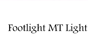
When making a decision we decided on two fonts called 'Dutch801 Rm BT bold' as the main font and 'Footlight MT Light' as our secondary font.

Mine and Adams pitch to the class.

Adam and I pitched our idea to our class as we wanted to know if people would like our idea. We spoke to the whole class and our teacher explainning what we intend to do for the music video and showed everyone work from one of our blogs. We showed them storyboards, the song its self and the video that has already been created for the song, we talked about what genre of music video it is and whether its a narrative, concept, or performance based music video. We handed out sheets to the class asking what they liked about our idea, and how could we improve what we intend to do. Below is a video of the pitch.


shooting schedule

Because we have finished our filming we could now give an evaluation within the shooting schedule. We extended this on two shooting schedules which is presented below.